


Our websites use cookies. By continuing, we assume your permission to deploy cookies as detailed in our Privacy Policy.
A Case of Sporting Goods Part II: Winning Strategies for the Homepage & Search
In the last article of the series, A Case of Sporting Goods Part I, we examined the current situation of the sporting goods market and discussed its challenges. Now, it’s time to move on to the next stage and share our winning strategies to overcome these challenges!
Key Takeaways
- Homepages are like window displays: They spark interest, tell a story and invite you in for further exploration.
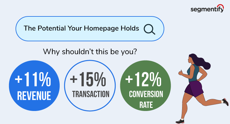
- Video killed the static: Use dynamic video banners to get and keep the customers’ attention and boost your conversion by 15%.
- Search results should be listed to appeal to each customer and reflect their personality and uniqueness.
📍 Winning Strategies for the Homepage
A website’s homepage is what a window display is to a brick-and-mortar store. A window display is designed and crafted with care to lure customers into the shop. This is true for homepage and window display designs: They are how you spark interest, tell a story and invite customers to explore your store further.
Read more: Visual Merchandising
The customer has landed on your website, peering through the window. It’s up to you to offer them the right journey to increase customer retention and customer lifetime value.
Let’s see how it’s done.
Personalised Product Recommendations
Everyone talks about personalised recommendations, but no one really explains what you must absolutely pay attention to. It’s a given in analytics to use purchase history, product/category/brand clicks, added-to-basket movements, etc., for recommendation purposes. However, you must not forgo browsing behaviour as it tells you so much about where people’s interests lie.
But what about first-time visitors? I don’t know anything about them to offer something personal!
You still have all that data from your other customers, though. Through the Segmentify Analytics dashboard or Google Analytics, you know your most popular categories, best-sellers, popular searches, etc.
Use this information to recommend the right products to the right customers on the homepage to get them out of the house and to the gym!
Achieved with Personalised Product Recommendations: CX optimisation, smoother customer journey, higher conversion and AOV
Personalised Dynamic Banners
Static banners are out; video banners are in. Get and keep the customers’ attention with videos chosen for them personally.
Whether you like it or not, video is the ruler of all content. People prefer video format over static images. Look at how TikTok is the go-to search engine for gen Z.
Let’s face it. Video banners on a webpage are fun. You can showcase ads, special campaigns, product demonstrations, etc. It’s truly up to your imagination!
Achieved with Personalised Dynamic Banners: Increased customer engagement, higher conversion
Personalised Brand Logo Orderings
We all have a favourite brand to shop from or browse from time to time to check out the newcomers or latest sales. And you already have that data through browsing behaviour and purchase history. You know what brands are more popular, so put them somewhere the visitors can see on your homepage.
Want to know a secret tip? You can customise the order of the logos if you wish to promote a particular brand. 🤫
Achieved with Personalised Brand Logo Orderings: Increased customer engagement, higher conversion, improved communication between the website and the visitor
You may want to keep your homepage less crowded and not put a bunch of brand logos. Here’s what you can do to show your visitors that you know them in such cases: Place the brand logos in the navigation bar. The tips and tricks mentioned above are valid here as well.
Achieved with Personalised Navigation Bar: CX optimisation, smoother customer journey, higher conversion, increased customer engagement
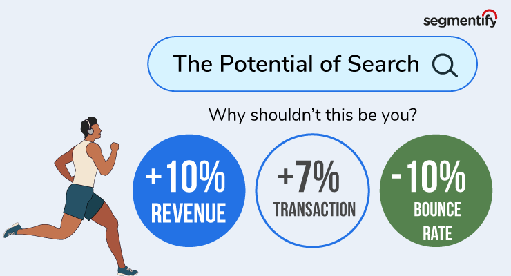
📍 Winning Strategies for the Search Areas
It’s almost a natural reflex—landing on a webpage and immediately clicking the search bar. “Search” is an inseparable part of our lives, so you should be paying great attention to it.
Before Search
Let me ask you a simple question: Why would you “just” have a search bar? Why?
“Before Search” is activated the moment a visitor clicks on the search bar. This is another content area where you can display popular searches/categories/brands, product recommendations, banners, last searches, etc., based on the visitor’s personal affinities.
Here’s a fun idea: You can always customise how the search box looks to match it with the website’s overall design!
Achieved with Before Search: CX optimisation, increased customer engagement, smoother customer journey, encourage product discovery
Personalised Search Results Page
Two users searching for hiking boots are not the same. They might belong to similar demographic groups, yet they are not the same. What they like and want will be different from each other. So obviously, when each of them searches for “women’s hiking boots”, they should get different results.
The search results should be listed to appeal to each customer and reflect their personality. That’s how you can guarantee their engagement and satisfaction. However, if you have specific products you want to promote, that can always be done in the background.
Achieved with Searchandising: CX optimisation, smoother customer journey, increased customer engagement, higher conversion and AOV
Don’t: Empty Search Results
Don’t ever show someone an empty search results page. You’re basically telling them, “We don’t have what you’re looking for. There’s nothing interesting here for you. You might as well just go away and look at another store.” You don’t tell this to a potential customer.
Customers using the search function are often highly motivated, deeper in the sales funnel and more likely to make a purchase. Which means you shouldn’t send them empty-handed. So what you need to do is to use what you know about your customers to bring up the most relevant offers, even when you don’t have what they’re looking for.
Achieved with Empty Search Results Recommendations: CX optimisation, higher conversion, lower bounce rates
Wrapping Up
To offer frictionless customer journeys, you must have a firm grasp of your customers’ pain points. What areas are most likely to hinder the journey and what can we do to eliminate those bumps? These are two of the most important questions you should ask yourself.
In this article, we’ve examined how Segmentify can help offer frictionless customer journeys and increase customer engagement through the sporting goods market and shared the results we’ve seen with our clients. Contact Segmentify to get more information on what solutions we can offer you.
Next week, we’re continuing with the next chapter in the series—A Case of Sporting Goods Part III: Category & Product Pages