We use cookies and similar technologies to enhance your experience. By clicking “Accept All,” you agree to the use of all cookies detailed in our Privacy Policy You can manage your preferences or withdraw your consent at any time
5 Common Mistakes You Do on Mobile Website
Imagine you go for a road-trip and look for a restaurant by the wayside. The first thing you do will be searching that restaurant on your mobile. Right? If mobile website of that restaurant is not responsive, unfortunately the contact information won’t be reachable by anyone! And, if customers can not get the information easily, they start looking for alternatives.
The most important element of digital marketing is conversion optimisation, and mobile site optimisation does matter a lot. If you have tiny buttons, and slow page loading times, you may loss potential customers coming from mobile.
Let’s check out the five user experience examples you may learn from:
1. Mobile incompatible website:
After Google announced that they would give priority at SEO for responsive websites, many of websites started to being responsive. If your website is not, users has to make pinch and zoom to get the required information and it will damage your website in terms of user experience. According to researches, responsive websites help you to increase conversions.

2. Mobile user experience negligence:

You may have a mobile website. It does not mean that your conversion rate increases for sure. There are behavioral differences between mobile and pc/desktop users. For example, mobile users want to reach up contact information first. Therefore; you, as a mobile website owner, need to design your mobile website according to this user experience to increase conversion. And of course, don’t forget to be user friendly, here.
3. Long and long forms:

Please accept, nobody wants to fill in a long form because it lasts process time to achieve their target. In mobile website, disadvantages are more than website. Because in mobile screen is so small and users need to complete each step by a finger. Please keep in mind that you need to avoid any kind of registration forms which is long especially for your mobile website.
4. Tiny links in mobile website:

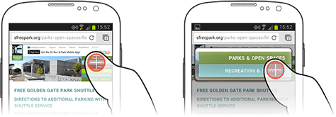
Have you ever clicked on a link by a mistake on your mobile? If the answer is yes, you have already known how compatible website does matter. The size standards can be changed according to the mobile brand. For Apple users if the link is 44 x 44 pixel, this provides user advantage.
5. Slow page loading time:

Mobile users are more impatient than desktop users. They expect to achieve target faster; therefore, mobile website needs to have a faster page loading time. The faster your mobile website load the content, the more you have loyal customers.


