We use cookies and similar technologies to enhance your experience. By clicking “Accept All,” you agree to the use of all cookies detailed in our Privacy Policy You can manage your preferences or withdraw your consent at any time
9 Elements You Need for an A-class Product Page (+1 Bonus)
The goal of an eCommerce store is pretty straightforward: Get your customers to purchase things. So how do you ensure your customers are informed enough to make purchases? How do you smooth out the buyer’s journey for them? The answer lies quite literally within the product page.
This article will talk about the nine elements that are essential for a successful product page design. We also have one secret element that will elevate your product page to the next level. Let’s jump right in!
1. Photographs and Videos
Product visuals are the quickest way to gather information about the said product. Plus, no one purchases anything without knowing what it looks like. Product images are essentially a customer’s first impression of your product because they are the first thing that your visitors engage with. In addition, product images attract the customers into looking for more detail on the product page.
Your product page must include photographs of your product as a whole, as well as pictures of important details that you want your customers to see. There are two options for photography on the product page:
- Show only your product on a monochrome background. These would focus more on the physical features of your product.
- Show your product in its real-life context. You can also show your product alongside some complementary products to increase your chances of cross-selling. Show your customers how the product can be used and what kind of lifestyle they’d be achieving.
You can use videos in the same way as well. You can either provide a 360° view of your product or use real-life videos to show your product’s potential, how it’s used, etc. So again, there is plenty of room for creativity and innovation here.
For example, the British fashion and cosmetic eCommerce store ASOS has taken its product page design one step further with its new “See My Fit” feature. This new feature uses AR to showcase the clothes on models of different heights and sizes so that the visitors can understand how the product would like on their body type. Cool, huh?
2. Product Title
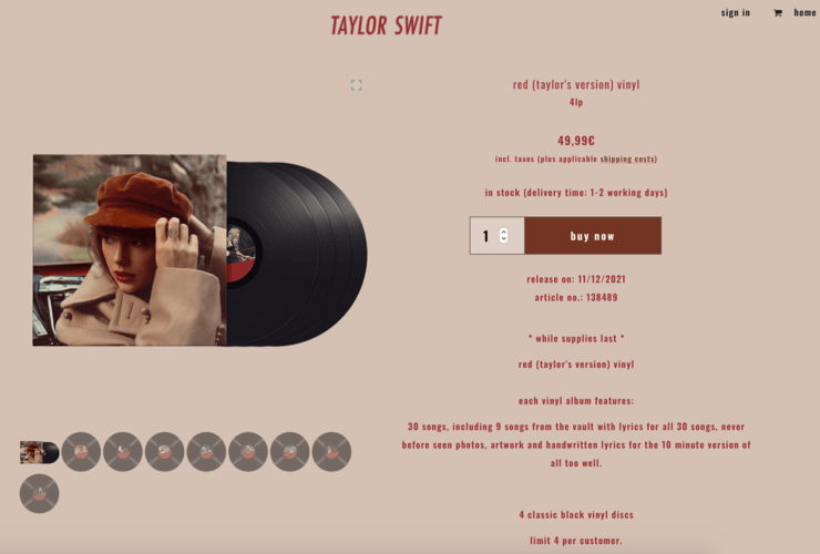
Along with the visuals, the product title is the first thing the visitors pay attention to. The purpose of a product’s title is to inform and intrigue potential customers. Therefore, product names should be descriptive and unique.
Getting creative is always an option, but don’t forget to answer this question in the most concise way possible: “What is this product?”.
3. Product Description
Not only that a well-written product description will help the customer who’s already actively looking at the product, but it will also help you get new customers through search engines. Therefore, the SEO friendliness of a product page is crucial if you want your website to rank higher on search engines. Just remember to write your product descriptions always for customers and not the search engines.
Here’s what you need to consider before writing your product descriptions:
- Who is this product for? Who’s the target audience here?
- What are the product’s details? Give the necessary information about the product’s dimensions, materials, functions, etc.
- When should the product be used? Not all products require this information but is there a suggested time of the day for its use? Skin-care products usually require this information to be given on the product page.
- Where should the product be used? Is it for indoor or outdoor purposes? Hot or cold climate? Etc.
- Why should someone choose this product? What makes it different and more desirable than your competitors’ products?
- How does the product work? Usually, the electronics category needs this information on the product page.
After contemplating these points above, consider this: Which ones do you need on your product page? Because 1) not every product needs all of those questions answered at the same time, and 2) no one will read an unnecessarily long product description.
Decide on the points that are vital for your buyer’s journey. Set a personality and tone for your brand. A well-written product description is helpful in getting your visitors to purchase the product and making your product more relevant for search engines.
Remember: A good product page should inform, excite, and engage the customers!
4. Call-to-actions (CTAs)
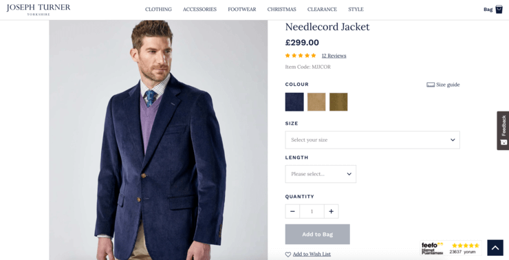
The goal is clear: Make the customer buy the product. How do you achieve this? With a clear call-to-action (CTA), of course. A good CTA should be easy to identify. It would be best if you didn’t try too hard to be creative while writing a CTA. The CTA should be easily understood so that the customer can quickly move on to the next step.
The most well-known examples for a clear CTA on the product page are: “Shop”, “Add to Basket”, “Add to Cart”, “Add to Wish List”, “Pre-order Now” etc. Trust these classics.
5. Pricing and Discounts
Whether the visitor is just browsing your eCommerce store or actively looking to buy, they will want to know the prices. If the customers cannot see the price easily on the product page, they will not move on to the next step. Meaning that they will not make any purchases. Pay attention to these two points:
- The price information should be easy to identify, both on the product catalogue page and the product page itself.
- If there’s a sale, you should show both the full price and the discounted price. In this case, cross out the full price so that there’s no confusion.
6. Delivery and Return Information
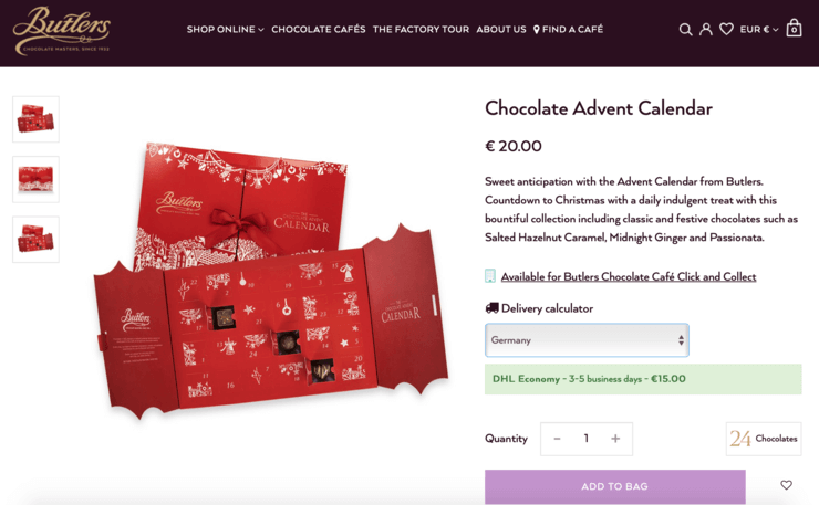
If the customer is browsing a product, they will want to know all the necessary information about the delivery upfront. Suppose there’s additional information about any other extra costs. In that case, this is the time and place to give them because 56% of consumers abandon carts when presented with unexpected expenses. We don’t want our cart abandonment rates to go up now, do we? So include the following information on the product page or add clear links to the product pages to lead the customers to the necessary information:
- Delivery costs
- Possible shipment day
- Expected delivery dates
- Which delivery company you’re working with
- Clearly explain how to return an item and what the conditions are for returning a product.
If you are shipping internationally, don’t forget to include a list showing all this information for different countries/regions.
7. Product Availability and Back-in-Stock Alert
Is the product available at the moment? Is it only available on the online store? Is it a pre-sale? If so, when will it be available? Or is it sold out? All this information should be given on the product page so that the customers know that they can trust you. In addition, some eCommerce stores purposefully chose to point out that there are only two products left available of those size 36 shoes! This is done to play into the customers’ fear of missing out.
In the case of an out-of-stock product, you should also make sure to add a “Notify me” button. This way, the customers could easily give their email addresses to get a back-in-stock alert when the product is restocked.
8. Product Variations
The information about the different sizes, colours, variations, etc., of a product should be available on the same page. Don’t send the customer on a treasure hunt. Most probably, they will not go on it anyway. For example, if the customer sees that “size 42” is not an option, they will probably think it doesn’t exist. So they will leave the page, or maybe even the website altogether, due to thinking this particular brand doesn’t produce clothes that size.
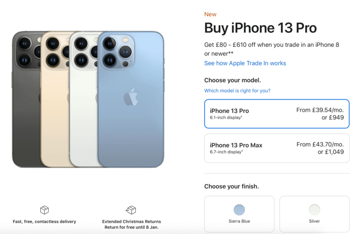
Look at Apple’s product page for iPhone 13, for example. There are two models, four different colour alternatives, and four different capacity options. As you can see, adding all the information about product variations makes the purchase process extremely simple. This also simplifies the catalogue management process for the eCommerce store.
9. Customer Reviews
There’s a greater chance of purchase if the product page includes customer reviews. Positive customer reviews are great tools in convincing customers to buy the product. Positive customer reviews can also tip the scale in your favour when visitors compare similar products with your competitors. 88% of consumers trust online customer reviews as much as personal recommendations.
Positive customer reviews on the product page are also great ways to promote your brand. Because satisfied customers do not just leave reviews about the specific products, they might also mention that they were delighted with the delivery and customer service they’ve received. This way, adding customer reviews to your product pages will build trust between your customers and your brand.
Do not ignore negative customer reviews! Negative customer reviews might sound like a disaster, but they don’t have to be. If you handle negative customer reviews professionally, own your mistakes, and do your best to solve the problem, they can actually help you. When dealt with correctly, negative customer reviews will show your potential customers that you care about them and are willing to spend time and energy solving their problems.
10. Bonus: “Selected for You” Section

At the moment, personalisation is the biggest trend in eCommerce, and it will only get bigger from here. It is a clever way to differentiate and distinguish your brand from that of your competitors. You would want to be known as the brand that always has the best products, suggestions, and taste, wouldn’t you?
Moreover, personalisation is a perfect way to increase your AOV without making it too apparent to your customers. You could:
- Recommend related products to cross-sell: Show your customer the perfect shoes and the coat to go with that suit they are looking at!
- Recommend alternative products to upsell: Encourage your customers to purchase a better (and more expensive) smartphone!
You know that you want to offer your customers a personalised shopping experience. After all, they deserve the best of everything. So how do you do that? We’re glad you asked.
The answer is pretty simple: Personalised Recommendations. Our machine learning backed algorithms work to learn from the actions your customers take. Unlike others in the market, Segmentify Personalised Recommendations does this by analysing the data in real-time. Not to brag, but that’s super exciting!


