We use cookies and similar technologies to enhance your experience. By clicking “Accept All,” you agree to the use of all cookies detailed in our Privacy Policy You can manage your preferences or withdraw your consent at any time
Is Your eCommerce Store Mobile-Ready?
We live in a fast-paced world, so fast that even texting has become too slow, and millennials have driven the use of voice and voice notes into our everyday lives. This means that the “old goldfish theory” of 8-second attention span is now being challenged on a daily basis from all directions, and eCommerce Managers must adapt to the ever-changing environment.
I speak with hundreds of eCommerce managers every month across 18 different countries, and it amazes me just how many are really mobile-ready.
Mobile use has been growing rapidly year on year since 2015, and the stats are there for everybody to see: 54% of all traffic has been coming from the mobile channel in 2021.
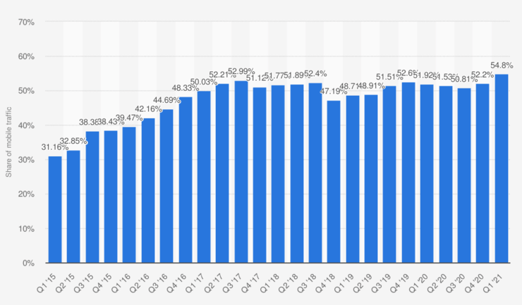
Source: Taken from statista.com
This tells us everything you do has to be focused on mobile-first, and if your website isn’t ready, you are driving customers to your competition. It’s as simple as that.
Now I know there are probably hundreds of eCommerce managers reading this right now (More like 20) saying, “This is old news. We are all mobile-ready, and we all have our sites optimized for our mobile traffic.” They would probably be all right but for one major piece of the puzzle – the strategy.
With this in mind, I think we still need to dig deeper.
On average, people leave a website after 1.5 scrolls
The good people of Nielson did a study to try and find out how much scrolling people actually do while on an eCommerce website. In their most recent study, users spent about 57% of their page-viewing time above the fold. In addition, 74% of the viewing time was spent in the first two screenfulls, up to 2160px.
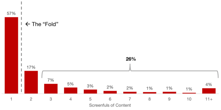
This data tells us that if you don’t have what your visitor wants in, let’s say, one and a half scrolls, they leave.
Just in case you haven’t noticed yet, here is the issue: Over 50% of your customers are looking at your shop through a 6-inch window. So you need to engage with them, hold their attention and get them to explore relevant products in under one and a half scrolls and maintain the 8-second attention span.
So, no pressure, really, but what do you do?
The consensus across the world is to place an offer or campaign in the banner and then select a few of your top sellers and basically hope for the best.
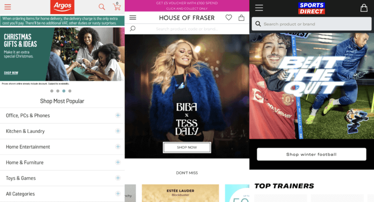
This has worked well up until now, but there are still way too many risk areas. Bounce rates are at a constant of 45.6% or above. The burning question is, how do we be everything to everybody? How do we engage with every single visitor, be relevant and personally pick out products for them in one and a half scrolls?
Here is how: The key to success, in my humble opinion, in one scroll, is how you use your data in that space. You need to connect with your visitor straight away and make them feel that this is their site.
How to use AI Personalisation to engage the visitors
AI Personalisation is the key here, but please make sure you’re using a serious engine like a hybrid collaborative tool, similar to Amazon’s. This will ensure that you will be able to predict what a visitor needs before they even know.
Now that you can collect “REAL” real-time data and learn about every one of your visitors, it’s time to use that data to make sure your site delivers what I like to call “Aha!” moments. This is similar to all those times you went on Amazon to find a garden hose and ended up leaving with 15 other things you didn’t know they had but, for some strange reason, just happened to be on your screen, and you actually needed it.
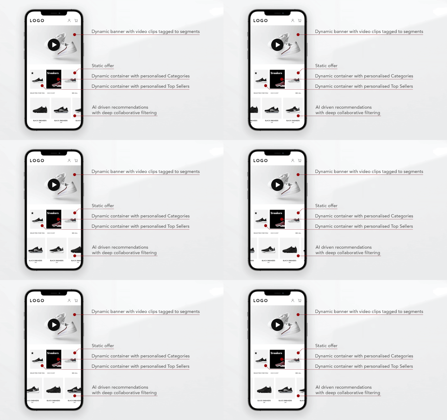
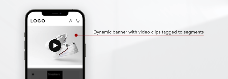
So, let’s go in for the kill straight away by giving them the ultimate personalised experience: A Dynamic Banner that plays product videos connected to each segment. So, make the site theirs straight away.
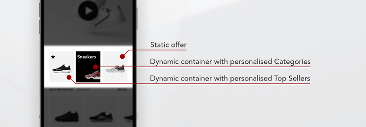
After this fantastic and comforting entry to your website, you need to follow them with their needs and desires rather than make them look for them. You have a 6-inch window to your shop with 1.5 scrolls and 8 seconds of attention span. Use it wisely.
Take the risk out of the “above the line” by using their data to merchandise the page. Dynamic containers with powerful category rocks algorithms and personalised top sellers are the best way to go here.
After this, you want to invite your visitor to get lost!
Or, as it’s technically called, “fall down a rabbit hole” and end up in your cart page with twice the amount of goods because you created “Aha!” moments for them.
To do this, you defy every web designers’ beliefs by using a Horizontal scroll. Yes, I said it, but make sure it has two algorithms working on it: “Smart offers”, which Amazon uses to create those amazing “Aha!” moments and “Top Seller” to always offer fresh ideas relevant to the visitor.
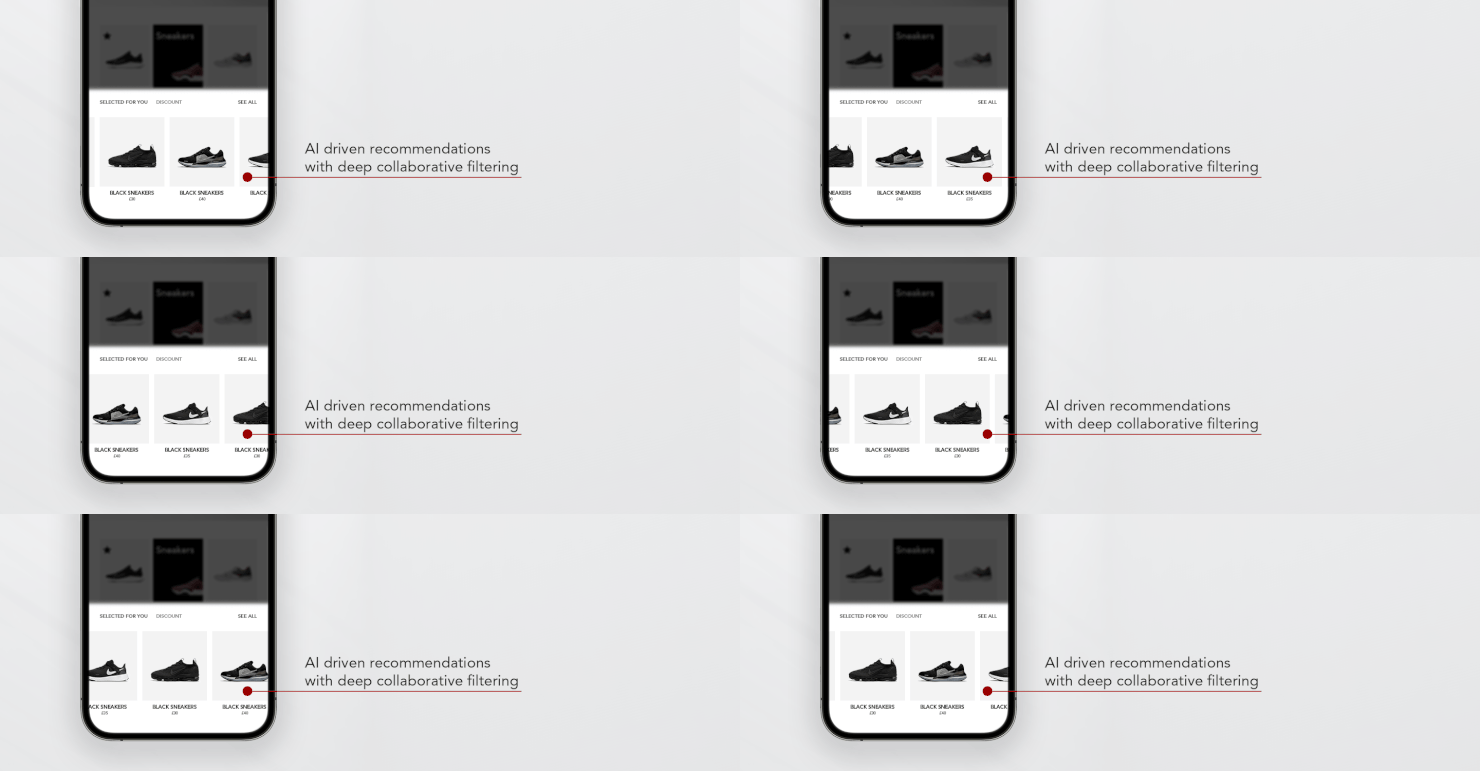
Here you need the recommendations to build a whole outfit from across categories and bring up future products for purchase that your visitor never thought about buying, which means that you should develop your customers’ tastes and product knowledge.
Design-wise, I would typically recommend a hover slider style with a leading product like below to entice more scrolling. Make sure to show a bit of the following product and lure your visitor into exploring.
Every site is different and has many influencing factors, but this type of strategy will significantly affect your bounce. Therefore, what’s discussed in this article will:
- drop your bounce rate by a minimum of 18% guaranteed;
- also increase your AOV by a minimum of 20%; and
- create loyal customers that will revisit, as now they see your user experience is top class, and you always have what they need before they even need it!


