We use cookies and similar technologies to enhance your experience. By clicking “Accept All,” you agree to the use of all cookies detailed in our Privacy Policy You can manage your preferences or withdraw your consent at any time
Show Me a Better Way, I Mean UX!
Okay, we track your visitors and monitor all actions on your website. We also create funnel(s) to track goal-oriented actions. We hope you’re doing it in real-time; especially content websites in terms of UX (user experience), and that’s why you pay 100k$ to Google Analytics Premium, right?
Oh God no! You’re not doing any of them? Now, go and do it!
Conversion Optimization with Google Analytics!?

By the way, do I mention tracking bulk customer actions on your website with Google Analytics means nothing for Conversion Rate Optimization? Yes, of course, it is important to know bulk data especially working on A/B tests; however, conversion rate means personalization in many cases.
Good, so you’re monitoring user actions and analyzed your customers’ data and what about next? Action time! Now, let’s think that your algorithm lying behind is awesome. It segments user behaviors perfectly to reach your goals every time. Showing right offers on the right time to the right people. Wooow! But, how you’re presenting it?
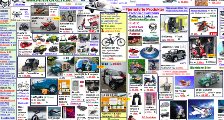
You invest your hotel 100M$ with all unique features but your “wayfinding” board looks like this: We know that creating the best algorithm (backend systems) to reach your goals is very important. Keep in mind that if you can’t show it in the right way, it may turn into a disaster. That’s why UX (User Experience) is a must to have ingredient in Conversion Rate Optimisation.
Why is UX important that much?
Let’s have a look at Checkout pages for example. It is the most important process for all online businesses. Keeping customers on this road and finish the process as quick as possible, works. Let’s assume you are recommending the most personalised items on checkout process as last minute offers. However, when you analyze your checkout process, you just realise that you also lose customers in this process. This is quite normal, customers comes and sometimes they go. What can we do in this process?
How do you present your offers?


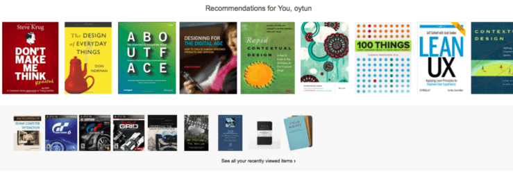
If you recommend like this one, your algorithm never saves you! However showing your items under related content with good looking lean design brings you more.
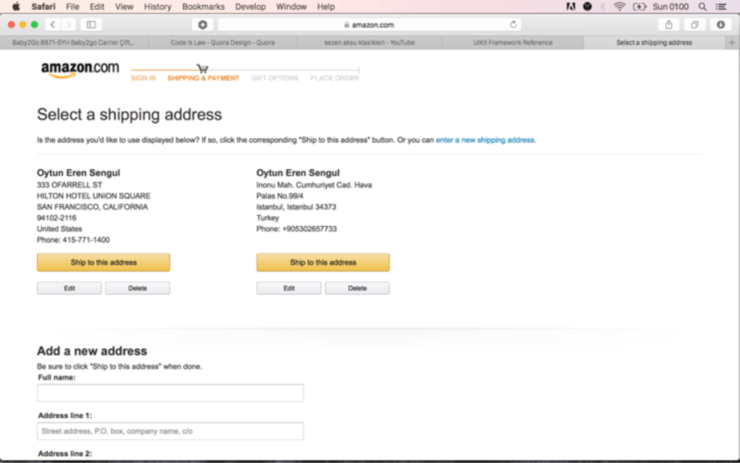
Let’s check what Amazon does

Just one simple feature pushes customers to finish the purchase process. There is no link to let the user go away from this process. It means there is no outgoing link in the process even Amazon logo which generally links to the homepage does not function here as expected!


