We use cookies and similar technologies to enhance your experience. By clicking “Accept All,” you agree to the use of all cookies detailed in our Privacy Policy You can manage your preferences or withdraw your consent at any time
Converting Product Pages | 6 Examples & 10 Tips for Consumer Electronics
Product pages are essential for your eCommerce website since that is where the sales happen. It is an excellent place for visitors to build trust and decide on buying the product. Here are 6 fantastic examples and 10 great tips for your electronics eCommerce website to check out and implement!
According to a recent eMarketer analysis, The Future of Retail 2020, eCommerce will expand to an $845 billion industry by 2022. Whilst eCommerce is proliferating; mobile commerce is also beginning to rise and leave desktop shopping behind. According to Forbes, mobile commerce will increase to 68% as people use their phones to shop by 2022.
On the other hand, the market for consumer electronics is predicted to surpass $365 billion in 2020 and $450 billion by 2024. Many people believe that electronics are essential; however, consumer behaviour is shifting about how and who purchases devices. This presents a particular set of difficulties for websites that sell consumer electronics.
Key Takeaways
- In addition to the homepage, product pages have equal importance since direct sales come from these pages.
- Good product pages allow users to browse the website for extended periods and eventually make faster, less hesitant purchases.
- Websites should keep it simple with high-quality images and videos and compelling product descriptions highlighting their unique selling points. They should use social proof, offer multiple payment options, include product recommendations, make it mobile-friendly, use A/B testing and monitor analytics.
- Customers should be able to browse products, see relevant suggestions, add items to shopping carts, and then complete purchases in a smooth process with a high-quality product page.
Why are Good Product Pages So Important?
For many websites, the homepage is the most crucial page that makes the visitor’s first impression. On the other hand, for eCommerce websites, in addition to the homepage, product pages have equal importance since direct sales come from these pages.
Product pages include visuals and written information regarding the product, information on shipping and payment, and other relevant information. Depending on the execution, these pages can increase or decrease online sales.
What Makes a Good Product Page?
Conversion rates are greatly increased, and cart abandonment is significantly decreased with the help of an excellent eCommerce product page. Customers should be able to browse your products, see relevant suggestions, add items to their shopping carts, and then complete their purchases.
A powerful product page also reduces the number of visitors who arrive at your website and leave without viewing any other pages. Successfully implemented product pages allow users to browse the website for extended periods, explore different sites, and eventually make faster, less hesitant purchases.
6 Examples of Good Product Pages
1. Apple iPhone 14
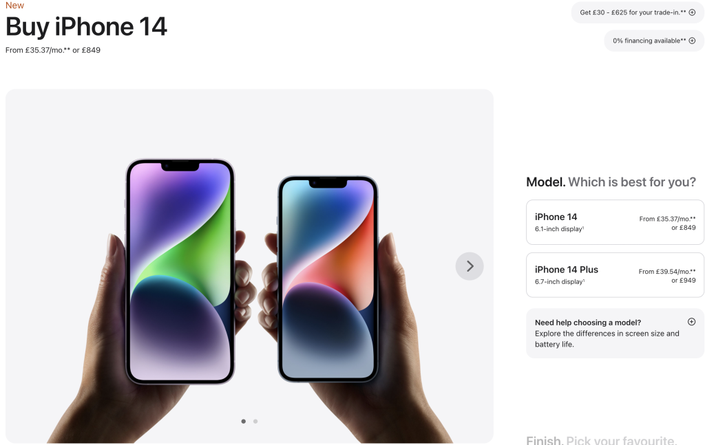
Apple is known for its website’s elegant and straightforward design. As seen in the picture, the product’s visuals cover more than half of the screen. On the right-hand side, Apple provides the visitor with simple questions and several options they can pick from.
2. Sony PlayStation 4
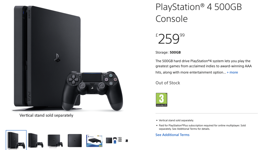
Sony’s PlayStation 4’s product page is carefully designed to inform the visitor about all the necessary features and information about the product. Compared to the iPhone’s product page, PS4 includes more product pictures and descriptions. Out-of-stock information is also added for the visitor to be aware of the stock information.
3. Samsung Galaxy S22
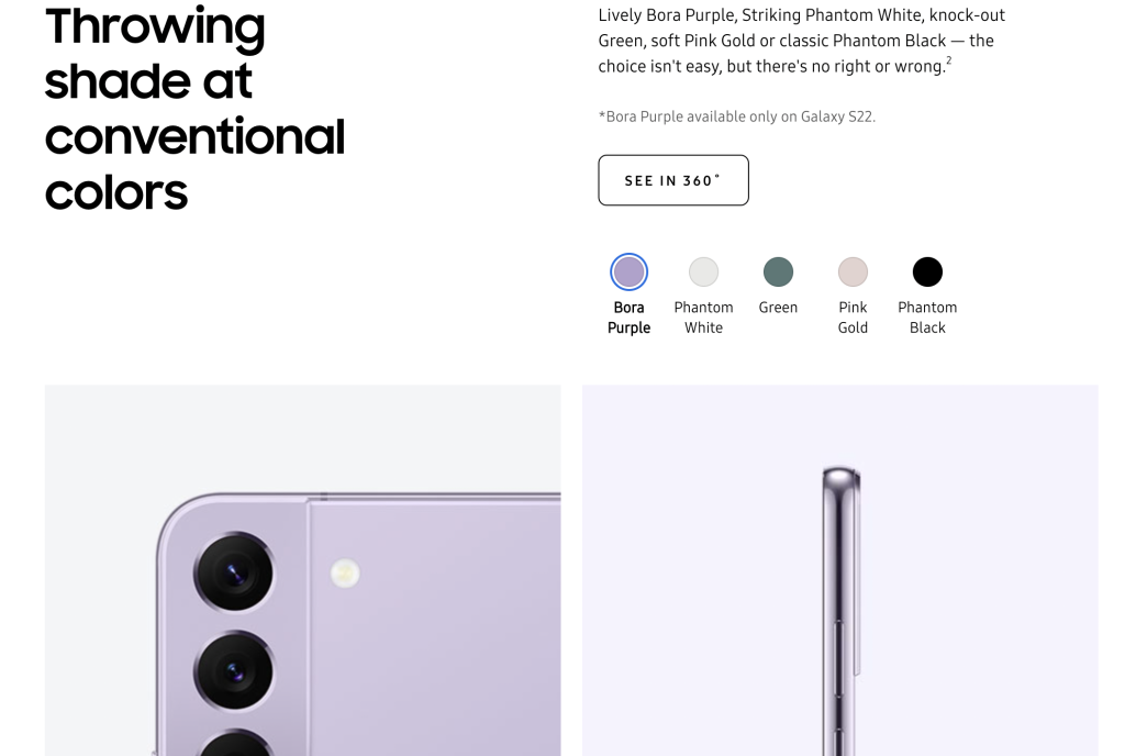
When we look at Samsung Galaxy S22’s product page, we see that they have covered every single detail about the product. The product page is relatively long, so the visitor must scroll down to learn more. However, since they have used many visuals, the visitor wants to scroll through to see more.
As seen in the picture, Samsung provides its visitors with many visuals and offers them a 360-degree view of the product as well.
4. GoPro HERO11 Black Creator Edition
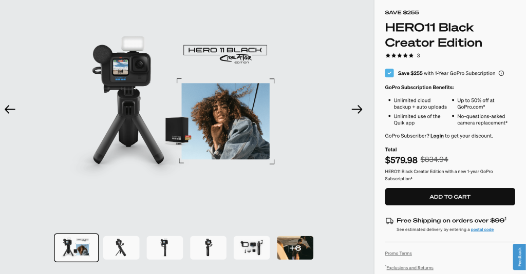
GoPro has a product page that includes the visuals of the product and the pictures taken from the product as well. On the right side, it has included information about price, shipping, payment and product benefits. In addition, they have also added a rating section where previous buyers rated the product.
5. Microsoft Xbox One S
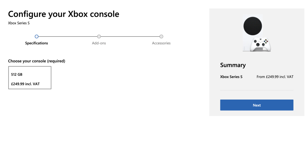
Microsoft has a relatively different product page design than the previous companies’ pages. The Xbox One S page has significantly less written content compared to other electronic products. The page is straightforward and asks visitors to choose from the options and get the most relevant product for themselves.
6. Beats by Dre Solo3 Wireless Headphones
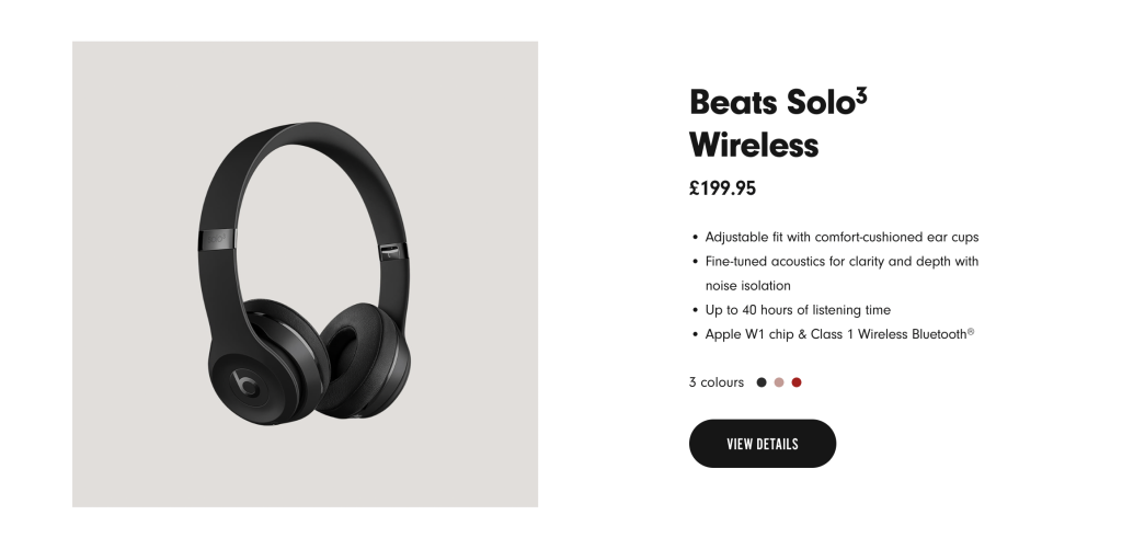
The Beats website is different from other electronic eCommerce websites. The Beats website includes all content, visuals and information about the products. However, the purchasing is done through the Apple website. Therefore, the product page is more of an informative page rather than a selling page.
10 Tips for Creating Great Product Pages
1. Keep it Simple
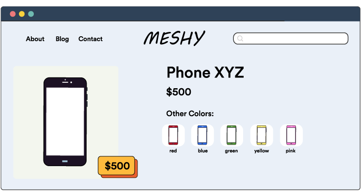
The keyword for the best product page is “simplicity”. The more basic design and the least amount of words explaining the most information are essential for the visitor to stay on the product page.
Written, visual and video content are important and necessary to describe and view the product. However, it is crucial not to overbear the visitor with much of this. Keeping the page on the same colour scheme, using easily readable writing fonts and adding the essential content on top would make a product page more appealing.
2. Use High-Quality Images and Videos
The most appealing images and videos are those that faithfully depict the product. Give the product a thorough overview with images taken from various perspectives, just like a customer could in a physical store. Additionally, websites can have some product demo images or videos to show the product in action.
Usually, electronics eCommerce stores do not include product videos since their products are pretty straightforward; however, depending on the product, it might be necessary to have a short video or gif showing the product in 360-degree vision.
3. Write Compelling Product Descriptions
Customers increasingly demand to know how and where the things they buy are made and supplied, in addition to basic information like product purpose, materials, ingredients, and sizing. Depending on your niche and brand, creative copywriting or narrative can considerably improve descriptions. eCommerce websites should not copy and paste content from other websites; doing so will result in your website being penalised by search engines. We always encourage eCommerce websites to include original content.
4. Highlight Your Unique Selling Points
A single statement summarising what makes your business unique and valuable to your target market is known as a Unique Selling Proposition. It is a brief justification of why a consumer ought to choose you over one of your rivals.
We believe it is vital to highlight the uniqueness of your product on this page. Try to answer the following questions as
- What sets this product apart from the competition?
- What is the feature that you want to highlight?
- What is the most exciting quality of this product?
5. Use Social Proof
Customer trust in the legitimacy of your brand is increased by social proof. Before making a purchase choice, more than half of internet shoppers read at least four product evaluations, and an astounding 92% of customers are more likely to believe non-paid recommendations than any other form of advertising. Customers give importance to honest and trustworthy reviews.
eCommerce websites can include a rating and a review section for their visitors to view to decrease the time customers can check out a separate review website.
6. Offer Multiple Payment Options
Another thing the visitor checks on the product page is shipping and payment information. Though this might not seem as important as the product information, it is crucial in decision-making. Offering multiple payment options will increase the chances of the visitor buying the product and trust on this online shopping experience.
Depending on the brand’s positioning, we recommend including 3-5 payment options for the visitor to pick.
7. Include Product Recommendations
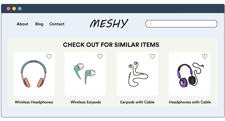
Upselling and cross-selling are successful strategies for raising the average order value (AOV) for the eCommerce website. Cross-selling suggests products that are similar or complementary to those your prospect is looking at. Upselling suggests a relevant item that costs just a little bit more than the one they’re already considering, occasionally with a unique discount offer. These strategies promote higher overall purchase amounts while upholding increased consumer happiness.
8. Make it Mobile-Friendly
Whilst running an eCommerce company, you might frequently modify your store. Finding the ideal mix and creating mobile product pages that convert is crucial. In 2021, mobile devices accounted for 58% of all web visits. In 2020, 64% of all online traffic will be on mobile devices.
eCommerce websites should recognise the importance of mobile devices in sales. eCommerce stores should make two separate and easy-to-use designs: desktop and mobile. Depending on the necessity, a mobile application can also be developed.
9. Use A/B Testing
The best way to analyse whether your product marketing strategy works is to do A/B tests with your visitors. A/B testing enables you to test a variation or component of your page that might influence your users’ behaviour.
By using A/B testing, eCommerce websites can find out if adding more in-depth product information higher on the page would impact the add-to-cart rate. Or you can experiment with different product names, pictures, or stock status messages.
10. Monitor Your Analytics
There is no right or wrong way to prepare your website; analysing your data and outcomes is a great way to see what’s working and what’s not. Using the results from your A/B tests, bounce and conversion rates, you can see what design and content work best for your website.
We believe that having daily, weekly, monthly, quarterly and yearly analysis reports will help eCommerce websites further understand the habits of your visitors.
Wrapping Up
Consequently, product pages are critical in a customer’s decision-making process for an electronics eCommerce website. Preparing the most relevant product pages for your brand personality and customers is essential to increase brand identification and conversion rates.
As previously mentioned, keeping a simple design is necessary to decrease the eye strain of your website visitors. Furthermore, it is essential to include all relevant information about the product, including pictures and videos. This will lead to the visitors trusting your website and encourage them to purchase your products. Finally, if that product is not what your visitor is precisely looking for, you should have a product recommendation section to recommend other relevant products to the original product. This way, you will be able to keep the visitor on your website and help them with their buying decision.


