


Our websites use cookies. By continuing, we assume your permission to deploy cookies as detailed in our Privacy Policy.
A Complete Guide to eCommerce Visual Merchandising
As the famous philosopher Jagger once said, “You can’t always get what you want.” However, “But if you try sometimes, you’ll find you get what you need.“
eCommerce, at times, is much similar to what Mick Jagger says in his hit song “You Can’t Always Get What You Want“. But certain tactics have been tried and perfected over the years in retail stores. While not confined to mortar and brick, these tactics can be adapted and used in your eCommerce business.
What is Visual Merchandising?
Before looking into the tactics you can use, it is essential to understand and define what Visual Merchandising is.
Visual merchandising is a valuable marketing tool used to engage your customers from the minute they walk into your store, or in this case, they click your website’s link, to the moment they leave. Retailers throughout the world have been employing these tactics to captivate as many customers and their attention as possible to an experience that is both beneficial to the customer and the business by leaving a lasting impression with the help of your brand’s voice.
Visual merchandising as a broad topic can include:
- Correct product placement
- Utilising the available space
- Showcasing rock-star products throughout the store all the way to the checkout.
This helps to strengthen brand identity, creates loyalty, brings more revenue, and generates repeat purchases.
6 eCommerce Visual Merchandising Strategies to Boost Conversion
While beneficial in brick-and-mortar stores, Visual Merchandising is also incredibly effective online. eCommerce can use Visual Merchandising to improve online metrics such as engagement, conversion rate (CR), time on site, and average order value (AOV), thus cementing Visual Merchandising as an essential element of your website.
Due to the volatility of the online experience, it is vital to create an environment that is relevant, personalised, and is easy-to-use. This is meant to guide the customer through the purchasing process as quick and hassle-free as possible. Presenting shoppers with relevant information, products, and offers is a must to convert potential customers into loyal and repeat customers before they jump into the next website or task.
While this may seem tricky, eCommerce comes with some perks that physical stores do not have access to, such as Segmentify. Segmentify is a personalised eCommerce platform that creates end-to-end, highly personalised shopping experiences for your customers from the moment they click on your website to the moment of purchase.
Online retailers do not have to optimise their stores for the average customer and their particular niche. An online store can alter and quickly adapt to its customer’s needs. They can change the locations of their displays as promptly as one click, adjust their website to the demographic data they collect and offer products based on the customer on the website by looking into their shopping activity—all in order to help with a quicker and better experience.
Keeping these in mind, let’s look into how we can use tried and tested brick-and-mortar tactics in the volatile world of online shopping.
Website Layout as the Store Layout
In-store visual merchandising looks into how to maximise the space usage and its effects on sales. Retail stores use techniques to determine which parts of the store are used the most, optimising the experience to showcase special promotions, new products, or best sellers in such areas. The goal is to display interesting products or promos to as many people as possible.
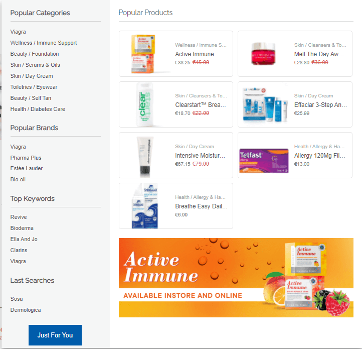
These tactics can also be used for your eCommerce store by analysing the data through services like Trendify by Segmentify or Google Analytics. You can determine which products or pages are driving the most traffic and focus your energy on promoting them further.
At the same time, via personalising these promos and products, you can specifically cater your products to each customer’s needs. For example, Category pages usually drive high traffic in eCommerce websites as visitors like to browse through your catalogue, similar to strolling the aisles of your favourite grocery store.
Placing personalised widgets with a high click-through rate or popular with your general audience at the top of these category pages will get your visitors’ attention. Plus, collecting and utilising behavioural data will help you personalise category pages, which will save your visitors from scrolling through thousands of products.
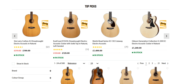
Like a shopkeep that knows you personally and can lead you to what you are looking for, widgets allow you to show the relevant products to your customers. This shortens the time that they spend pointlessly scrolling through your catalogue, which can cause them to leave your store without buying anything.
Website Homepage as the Window Display
The first thing a customer sees in the physical world is the window display. The window display is a place that is meticulously prepared to draw in a lot of potential customers into the store. Therefore, it becomes a great place to show new products, bestsellers, and on-sale products.
While as widespread as they are, window displays are vastly impactful and can make a lasting impression on your potential customer’s mind. Therefore building your website’s “homepage” is incredibly important since you need it to create interest, tell a story, and inspire customers to continue their journey through your website.
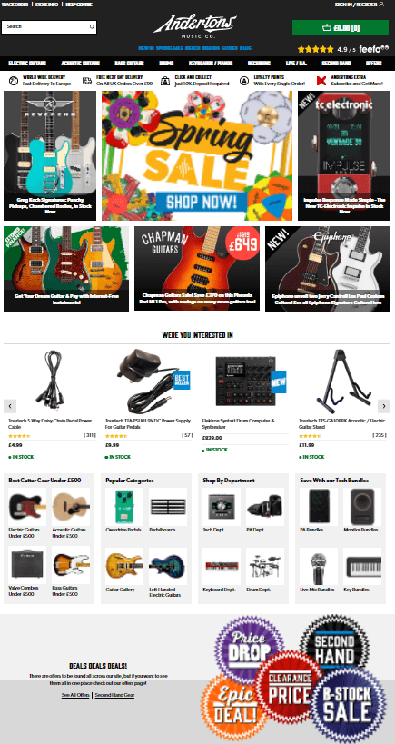
You can use this space to intrigue potential and returning customers to take a look at specific promotions, products, and services you may be offering. You can use strategies such as Personalised Dynamic Hero Banners and track their performance using Bannerify by Segmentify or Personalised Brand logos to lead customers to brand pages and create an inviting and reassuring landing page.
While physical retail stores use signs to lead customers to their destination, such as grocery stores’ overhead signs on the aisles indicating the contents of the shelves, eCommerce stores have navbars (navigation bars), menus, and search bars.
Suppose you have a lot of products on your website. In that case, to optimise the customer experience, your menus and navigation throughout your website should follow a natural flow so that your customers do not get lost in the aisles of your website.
There are a lot of different styles of menus to choose from. However, you should choose to go with the one that will give your customers the best experience for navigating your website and its aisles.
Search Bar and Search Box
A considerable number of customers visit websites with a product in mind. To reach this particular product, they use your website’s search box. The importance of a search box on a website does not only shine when someone has a specific product in mind but also if they want to browse your store.
Search areas help visitors find the product they have in mind—just like an in-store shopping assistant. Therefore, an intelligent search box is a must for eCommerce. You can utilise the search area for recommending products throughout the search journey, starting from the moment they click the search bar.
In addition, you can use different search banners and buttons and features such as “auto-complete” or “my last searches” to help your customers reach the products they are searching for, making the experience of shopping on your website more seamless.
Online Social Proof as In-store Store Events
While overlooked in many online and physical stores, Online Social Proofing or Events are a great strategy to attract customers and pique their interest.
As no one wants to eat at a completely empty restaurant, online shopping can be the same. In the online world, most of the websites we shop from might feel empty or that no one is purchasing anything from them, even if this is not the case.
To counter this, you can use social proofing to show your customers the number of likes, current views, baskets, and purchases and how many people purchased the product right on the product page. With this display of information, you can create the “Fear of Missing Out (FOMO)” mindset. The stock information can also be displayed on the page and show your customers how popular a product is to nudge them in the correct direction to make a purchase.
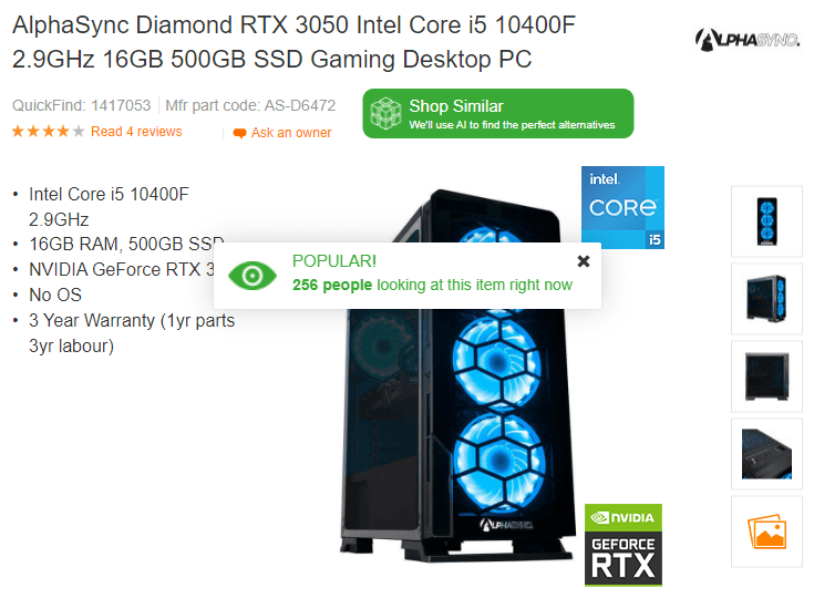
Social proofing is essential in eCommerce because you cannot physically see how many people are in the store buying products alongside you, which helps your customers immensely with finalising their decisions.
Product Recommendations as Bundles
Bundling is a technique that Fashion Retailers have used to promote products that “go together” to push certain products as a whole instead of just single items. And this tactic can be easily adapted to and used in eCommerce.
Although there are many ways to achieve this, one way of accomplishing this on your eCommerce website is to create widgets on your product description page to show different products together in a set.
Complete the Look
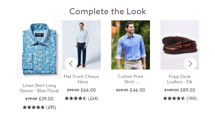
The customers who see such recommendations will be more inclined to take a look at the other products even if they don’t purchase them straight away as a set.
In addition to showing products together, making it easier to purchase them as a whole by adding add to cart buttons or deals on whole outfits can also help convert those who are just browsing to repeat customers.
Again, this has been a tried and tested strategy for many brick-and-mortar stores, and its effects on eCommerce have been undeniably potent. Using this technique not only sells more products as it inspires your customers to consider what products go together but also takes them on a journey through your website.
Frequently Bought Together
In addition to whole outfits, you can employ a tactic that Amazon is currently using to sell complementary products.
For example, when looking for a TV on Amazon, you will usually get recommendations like HDMI cables and TV Screen Cleaners. With these recommendations, you essentially show people what they might need and might have forgotten.
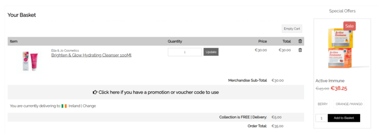
Online Checkout Optimisation as the Checkout Line
The checkout or the basket page might look like the last stop on a shopping experience; however, this is not always the case. The basket page is the prime spot for increasing your AOV by recommending low cost/high margin products that appeal to your customers.
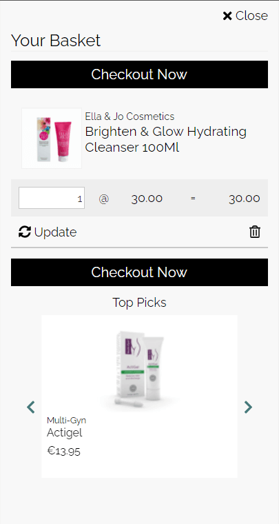
For decades, this upsell strategy has been seen in grocery stores, with products close to checkout appealing to us. Whether it is a piece of gum or a can of soda, we tend to have a second look and have the tendency to purchase the said products.
In eCommerce, the story stays the same. When the customer is ready to end their shopping journey at the checkout, you will be able to recommend impulse buy products to your customers to increase your AOV and upsell a product.
As the last stop to make an impact, the checkout step is the space for you to show your customers how many points for your in-store loyalty program they have or, if they are not a member of the said loyalty program, how they can sign up for it.
While it is important not to disrupt the flow of the checkout and to make it as painless as possible for your customers, you can use popups, widgets, and anything in between to make sure that your customers have another look at one or more of your products to increase your AOV.
Checking Out
Visual merchandising is not just for brick-and-mortar stores anymore! Thanks to Segmentify, you will be able to recommend visually pleasing and relevant products to your customers to help them through their journey through your website.
By employing some of the strategies above, you will be able to increase your engagement, conversion rate (CR), time on site and average order value (AOV), helping you grow your business and retain more customers.