We use cookies and similar technologies to enhance your experience. By clicking “Accept All,” you agree to the use of all cookies detailed in our Privacy Policy You can manage your preferences or withdraw your consent at any time
Travel Booking On-Site Search Tips & Best Practices
Let’s say you want to get out of the city for the weekend or go for an adventure in a faraway place for a couple of days. What is the first thing you do? Search for accommodations in your desired location, right? After all, you need to know where you’re staying to assess your budget.
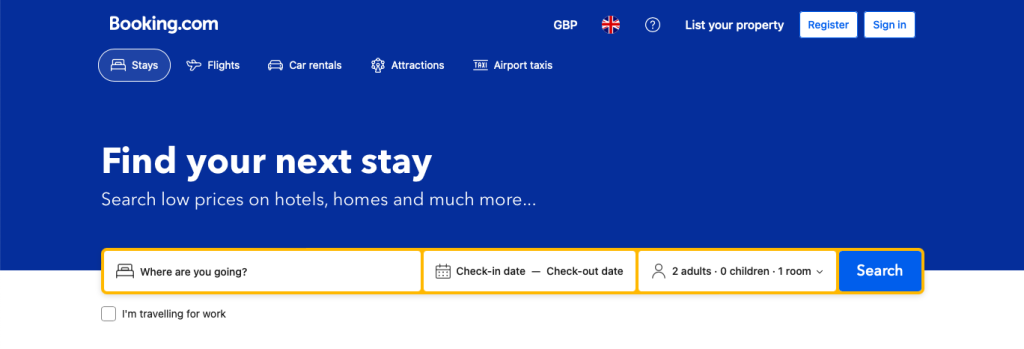
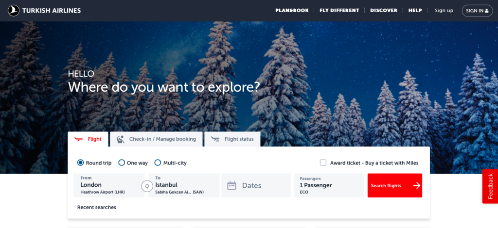
Even though search is the reasonable accommodation-finding strategy, 25% of travel booking websites don’t make the on-site search feature the primary content on their homepages. These guys are making a grave mistake. Here’s how to be smarter than them:
Key Takeaways
- The on-site search is the preferred starting point for booking travel accommodations.
- A difficult-to-spot on-site search function will create a bad first impression for travellers and may cause high bounce rates.
- 25% of travel booking sites, however, fall into the trap of overcrowding the homepage, causing them to lose sales.
5 Benefits of Making the On-Site Search Feature the Primary Content on a Booking & Travel Homepage
Upon examining some airline and hotel booking sites, we see they easily fall into the trap of overcrowding the homepage with not-so-critical elements. Before you get all riled up, hear us out:
In most cases, travellers looking for accommodations have a specific travel date and destination in mind. Therefore, the search function is their preferred starting point for booking travel accommodations.
Spark wanderlust year-round with captivating content and engagement hacks! Download free Travel Marketing Playbook.

1. Increased User Engagement
According to a study by Baymark, nearly all subjects (99%) shopping at online travel agencies (OTAs), large-brand hotels and whole property rental sites directly looked for the “booking” search feature on the homepage.
A difficult-to-locate “booking” on-site search feature on the homepage will unnecessarily delay most visitors from taking the first step toward identifying a suitable flight or hotel room. A clear-to-spot search feature, on the other hand, will significantly improve customer engagement.
2. Improved Usability
Continuing from the same Baymark study, what’s interesting is that almost all the OTAs, large-brand hotels and whole property rentals included displays the “booking” on-site search on the homepage. The problem was that they were not successful in giving importance to the on-site search; it was lost among everything else on the homepage.
For travel booking websites, a simple homepage design with on-site search as the main feature will improve the website’s usability.

3. Enhanced User Experience (UX)
We’ve already established that the on-site search is the first thing visitors look for on a travel booking site. Making the on-site search feature the primary content on the homepage of booking and travel websites will take the frustration out of the visitors’ shopping journey, improving their experience.
Even if they don’t book their accommodations right away, they will remember your brand when the time comes. Keep in mind that a good reputation for offering an A-class UX will go a long way.

4. Increased Conversion Rates and Revenue
Allowing the on-site search to be the main attraction on the homepage of a travel booking website will be the foundation of a frictionless customer experience, which, in return, will be reflected in higher conversion rates and sales.
Discover how Europe’s number one online pet-friendly travel booking destination PetsPyjamas improved conversion rates by 3x with personalisation.
5. Easier Access to Information
We went over this many times in this article but let us repeat it once more: What travellers want from travel booking websites is for the on-site search feature to be easily spotted. They don’t want distractions; they want information.
What do we mean by information?
Travellers want to know:
- Is there a flight from London to Rome on March 15?
- Does the flight fall in their preferred price range?
- Are any hotel rooms available in Rome city centre for March 15-19 for 2 adults?
- Is the hotel pet friendly?
- Do they offer free cancellation?
By making the on-site search easy to spot, the travel booking website will ensure that the visitors find all the information they need a lot quicker than they would on a travel website with an overcrowded homepage.
However, making the on-site search feature the primary content on the homepage of travel booking websites means the website itself gets easier access to information about what the customer wants from a holiday. This information is so valuable because it comes directly from the customer. They literally tell the website what they want out of a holiday.
The travel booking website in question can later use this information to send retargeting campaigns to the customer with other offers through cross-channel messaging. Mind you, a traveller searching for and booking a scuba diving tour once doesn’t mean they’ll want to do it the following year. However, hitting them up with other adrenaline-packed options is a good idea.
Information and data are gold, my friends.
3 Best Strategies for the On-Site Search Feature on Travel Booking Sites
1. Implementing Search Filters
Let’s take a page from booking.com’s book and look at what on-site search filters they’re using:
- Budget per Night: An critical decision factor for almost all travellers.
- Popular Filters: To improve the UX, the most popular filters are placed right under the budget filter. It includes free cancellation, [destination name] by city centre, 4 stars, less than 3 km, breakfast included, superb rating and hotels.
- Star Rating and Review Score: Social proof is a solid psychological tool that helps customers make decisions.
- Distance from the Centre of [Destination Name]: Some travellers are willing to strain their budgets a bit more if that means they can just walk around the city without needing public transportation.
- Cancellation Policy: For travellers who want to account for unforeseen events that might come up, “free cancellation” is a blessing.
- Property Type: The options include entire apartments, hotels, youth hostels, B&Bs, guest houses, etc.
- Property Accessibility: A vital information for travellers with disabilities.
If you’ve ever used booking.com before, you know that they use more filters than listed here. The main takeaway here is that a travel booking site should identify meeting points between what they are offering and what their target audience wants. The on-site filters should be selected according to that meeting point.
2. Leveraging Search Autocomplete and Misspelling
Did you know that the autocomplete feature can boost sales by 24%? An on-site search and discovery solution with autocomplete will get the customer to the desired destination faster, pun very much intended.
On the other hand, certain people might find it difficult to spell “Ljubljana” correctly. The last thing a travel booking website wants should be sending their customers to a dead end. Therefore, use an on-site search feature that accounts for misspelling to avoid higher bounce rates.
3. Understanding User Intent to Improve Search Relevance
Irrelevant search results are a big no-no for all customers, let alone travel booking site customers. In fact, 68% stated that they would not return to a website with a poor search experience.
The more relevant results you provide your visitors, the more likely they will be satisfied, engaged and eventually converted. An effective on-site design should therefore encourage visitors to search first and then navigate through the results.
Provide personalised search results based on the traveller’s previous searches, booking histories or wishlists. For first-time visitors, use popular destinations and options to personalise their search results based on their search query.
For more information, check out How to Improve Search Relevance in 9 Steps.
Wrapping Up
On-site search is a must-have feature for all websites. However, when it comes to travel booking, on-site search should be the star of the show. It is the primary feature their customers will be looking for when they land on the homepage of the said travel booking websites.
You know what they say: First impressions are lasting impressions.


